In addition to people saying, “I can’t draw,” individuals often tell me, “Your handwriting is so neat, but mine looks like chicken scratch” or something similar. Regardless of your written language or style (cursive handwriting or print handwriting for many languages), it is possible to improve the quality of your writing.
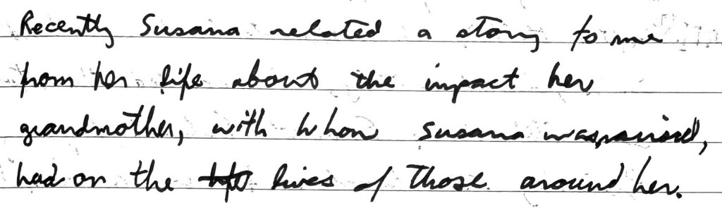
My third grade teacher, Mrs. Sloan, taught me cursive in 1977, and I used cursive until the early 2000s. You can see this scan from a story journal, and my handwriting—my cursive—was terrible. I could barely decipher it. Shortly afterward, I started a handwriting journey resulting in a completely-changed writing style.
I read a couple of stories about people who had written out the entire Bible by hand (788,258 words for the King James Version). I decided to do a test by writing a psalm per day for 30 days and enjoyed the experience. Since I knew my messy handwriting wouldn’t be satisfying, I made efforts to write slowly, in print.
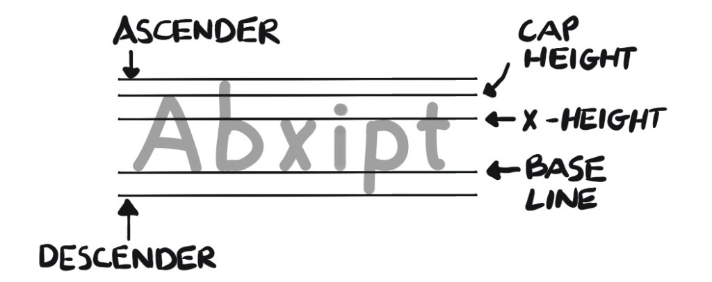
Over time, I switched my lowercase “a” from what I learned in first grade (a) to the standard printed and typed “a.” I also modified “g” in the same way (g). A standard font has rules using guidelines such as the cap height, extender, descender, and x-height lines, which I learned about while exploring fonts and letter forms.
After regular practice (by writing chapters from the Bible) while being mindful of how I formed letters, I was able to change my handwriting.
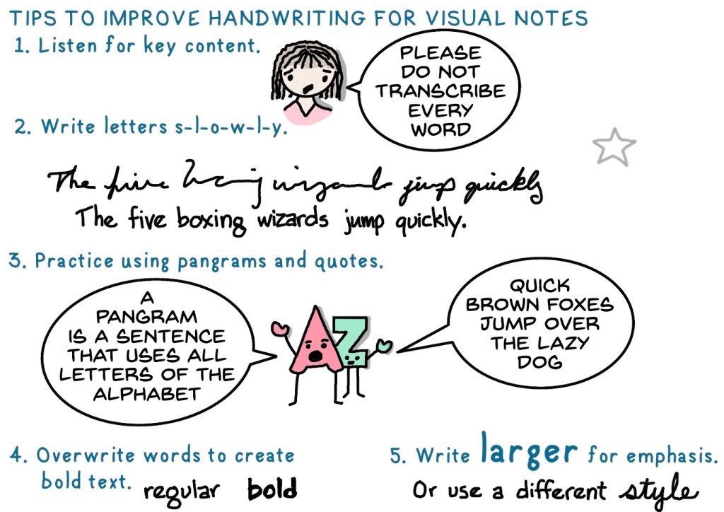
Below are some tips to improve your handwriting for your visual notes.
Listen for key content. An important part of visual notes is listening. Transcribing every word doesn’t help with content retention or studying, and can be frustrating when you get behind or lose focus. Listen for key content and decide what to add to your notes.
Write letters and words slowly. Writing slowly is beneficial for improved control, attention to detail, identification of mistakes (to correct or prevent them), and consistency and uniformity, such as, completing each letter shape, allowing slight spaces between letters, and keeping letters on the baseline. Writing for readability means you may have to write fewer words, since you still need to stay at pace with the presenter.
Think of each letter as an image. Letters are just small, frequently repeated graphics. While you don’t have time to be detailed like a scribe carefully writing an illuminated manuscript, thinking of letters as graphics can help improve your handwriting. Instead of hastily scribbling a word, consider each letter’s contribution.
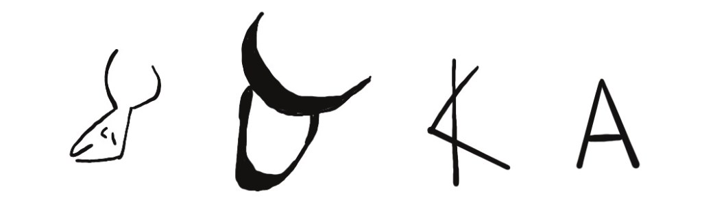
The alphabet has evolved over thousands of years. In the Mediterranean region, Egyptian pictorial hieroglyphics were gradually replaced by simpler letter forms. The Greek alphabet is the foundation for English letters.
Practice with guides. Use lined or grid paper to practice writing. Although standard lined paper does not include the x-height, descender, and cap height lines, the structure of the lines will help you attain consistency in letter forms.

Practice using pangrams and quotes. A pangram is a sentence using all letters of the alphabet. This is a list I frequently use:
- The five boxing wizards jump quickly. (31 characters)
- Pack my box with five dozen liquor jugs. (32 characters)
- Quick brown foxes jump over the lazy dog. (33 characters)
Overwrite words to create bold text. Tracing existing words requires slow, deliberate effort to ensure accuracy.
Write differently. By writing words larger or in a different style, you can easily emphasize key content.
Look At My Notes
This post is from Look At My Notes! How to take and share visual notes. It is available at Amazon.com.
Visual notes consist of text and graphical elements arranged to enhance learning. Because emphasizing content visually makes it memorable, visual notes are ideal for learning, training, and handouts.
In Look At My Notes you will learn (1) how to take and share visual notes with others, (2) why visual notes are effective, and (3) what to include in your visual notes.